There’s no question that data is one of the most important assets a business can have. Businesses typically collect as much data as possible, which may include data from internal systems, as well as data from external sources. They can then use this data to make appropriate decisions for future business operations and success. However, making sense of that data can be a daunting task, as it needs to be transformed into a format that is easy to understand.
Data visualization is an effective way to make sense of your company’s data and includes chart types like line charts, bar graphs, pie charts, and radar charts. Keep reading to learn more about radar charts, including how to use them and tips for how to create a radar chart.


What is a radar chart?
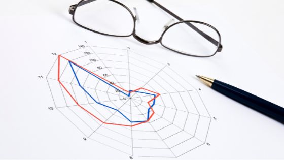
A radar chart, also called a spider chart, is a graphical tool that displays data as a set of radial lines radiating from a central point. The radar chart is used to compare and analyze the similarities and differences between data sets. It can be used to compare two or more sets of data or to compare data sets at different points in time.
How do you use a radar chart?
Radar charts can show the comparison and analysis of data points in three dimensions. They can be used to compare items on two axes or to compare items on two axes and a third dimension that is represented by colour or size. Radar charts are often used to compare performance data, such as sales figures or website traffic, across different time periods.
One way businesses can use radar charts is to track customer satisfaction over time. This can be done by plotting customer satisfaction ratings on the radar chart and then tracking the changes in the ratings over time. This can help businesses identify areas where they need to make changes in order to improve customer satisfaction.
Radar charts can also be used to track product satisfaction. This can be done by plotting ratings of different aspects of a product on the radar chart and then tracking the changes in the ratings as time progresses. This can help businesses identify exactly how they can implement changes to improve product satisfaction.
Radar charts can also be used to track employee satisfaction. This can be done by plotting ratings of employee satisfaction feedback surveys on the radar chart and then tracking how the employees change their thoughts over time. This can help businesses identify how they can improve employee satisfaction.
How do you create a radar chart?
To create a radar chart, you will need to organize your data in three columns. The first column should list the data points that you want to compare, the second column should list the axes labels, and the third column should list the values for the data points.
To create a radar chart in Microsoft Excel, you can use the following steps:
- Create a new Excel spreadsheet and enter your data into three columns.
- In the first column, list the data points that you want to compare.
- In the second column, list the axes labels.
- In the third column, list the values for the data points.
- Select the data in the first column and insert a radar chart.
- Select the data in the second and third columns and insert a scatter chart.
- Right-click on the data in the scatter chart and select “Format Data Series.”
- Select the “Marker Style” tab and change the shape to a radar chart.
- Click OK. Your radar chart should now be updated to include the data points from the scatter chart.
When creating a radar chart, it is important to make sure that the data is properly formatted. The data should be in a table, with one column and one row for each data point. The data should be formatted as either text or numbers, with no special characters or symbols. Once the data is properly formatted, it can be inserted into a radar chart. The data can be entered manually, or it can be copied and pasted from a table. The data should be entered into the chart in the same order as it appears in the table.
The chart should also be customized, including resizing and rearrangement of the spokes. The colours and the symbols can also be customized. This will help you make sure your data is clear and that it accurately represents what you are trying to communicate.
What are the benefits of radar charts?
Radar charts are often used to display how different factors are related to one another. They can be used to compare different data sets or to compare data sets at different points in time. For example, you could use a radar chart to compare the percentage of women in management positions at different companies over time. Radar charts are especially useful for visualizing data that changes over time or space. They can also help you to see patterns and relationships that might not be visible in other types of graphs.
What are the challenges of radar charts?
Radar charts can be difficult to read if they are not well designed. In order to be effective, they must be designed with the user in mind. The axes must be labelled clearly, and the data must be presented in a way that is easy to understand.
Another challenge with radar charts is that they can be difficult to create. The data must be arranged in a specific way in order to create the chart, and if the data is not arranged correctly, the chart will not be effective.
Radar charts are an essential tool for taking your business to the next level of success. They allow you to easily track and compare data points so you can identify trends and make informed decisions. Use this article as a guide to ensure that you are taking full advantage of all that radar charts can do for your business.


